2021
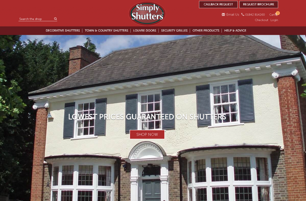
We’ve given our website a little facelift. But don’t worry we haven’t changed our great products. Take a look at some of the new additions to our website including a new and improved homepage featuring a drop-down menu displaying the different categories for each of our popular product ranges.
We have also added a brand new ‘Help & Advice’ section which includes easy access to our buying guides, colour chart and FAQs as well as our extensive product gallery and our blog.
In addition, we’ve made it even easier to get in touch with us by incorporating ‘Callback Request and ‘Email Us’ buttons on the homepage banner. Why not get in touch today and one of our friendly team will be happy to help.
So, what was wrong with the old format?
There was nothing wrong with how the website used to look but as styles and designs develop, we took valuable advice from our SEO team and made some changes to offer the best user experience to our customers. So, by improving the look of the website and removing some of the ‘clutter’ our customers will be able to take full advantage of these changes regardless of whether they are using a desktop, tablet, or mobile phone.
We still offer the same products, at the same competitive prices although it is now even easier to shop for them. So, head over to www.simplyshutters.co.uk and take a look around.
Simply Shutters – a name you can rely on!


